Free Inspiration:
Feeding the world, starting with Africa
Case Study 3 ~ 6 min read

The Problem
A crowded, disorganized donation website creates barriers to giving. Cluttered layouts, scattered information, and a hard-to-find donation section leave supporters confused and less likely to contribute.
The process
User research and synthesis, ideation, prototyping, interaction, usability testing
My Role
UX/UI designer
Tools
Figma
Duration
4 Weeks
The Solution
The redesigned donation website transforms a cluttered, confusing experience into a streamlined and trustworthy platform. By simplifying navigation, centralizing donation options, and presenting information in a clear, visually appealing way, supporters can easily find causes, understand impact, and complete donations without frustration—making giving feel effortless and meaningful.

Simplified Forms
Step-by-step donation flow with clean input fields and payment options reduces friction and speeds completion.

Clear Donation Path
A prominent, consistent “Donate” button across all pages ensures supporters can contribute from anywhere on the site.

Organized Cause Listings
Structured cards with images, brief descriptions, and ratings make it easy for users to choose where to give.
01 Research
Donation-Based Giving Needs Clarity and Trust
Through interviews and feedback synthesis, I gathered insights into how people experience donation-based giving online. Users consistently voiced the need for clear, emotionally engaging, and trustworthy platforms. While they want to support causes, many are deterred by confusing layouts, unclear donation flows, and a lack of transparency about impact.
From this research, I identified patterns in their motivations, needs, goals, and pain points when interacting with nonprofit websites.
Needs:
Clear donation flow, visual storytelling, transparency, mobile-friendly design, and easy sharing.
Goals:
Build trust, make giving easy, show impact quickly, and create emotional connection.
Pain Points:
Build trust, make giving easy, show impact quickly, and create emotional connection.
Motivations:
Supporting causes they connect with, inspired by stories, and motivated by quick, easy, meaningful actions.
Competitive Research Summary
I conducted a SWOT analysis of Charity: Water, GlobalGiving, and UNICEF.
Strengths: Charity: Water excels in emotional storytelling and transparency; GlobalGiving offers donor choice and grassroots connections; UNICEF has global reach, credibility, and major partnerships.
Weaknesses: High costs, limited scope for certain aid types, and bureaucratic processes that slow impact.
Opportunities: Growth in social fundraising, expanded aid niches, and increased support for grassroots efforts.
Threats: Competition from other global nonprofits, evolving donor expectations, and economic or regulatory challenges.
Insight: A nonprofit that blends emotional storytelling, donor flexibility, and global credibility—while streamlining operations and increasing transparency—could fill a valuable gap in the market.
The Cause-Driven Supporter
The Visual Learner,
The Trust Seeker

Soul Lucas
26, New York City, Single, Freelance Artist
Cause-driven creative who supports mental health, education, and climate justice, seeking simple, trustworthy ways to donate, share, and promote causes online.
The Cause-Driven Supporter
Passionate about mental health, education, and climate justice.
The Visual Learner
Prefers bite-sized, visual updates over long text.
The Trust Seeker
Wants simple, clear ways to give and share without doubting legitimacy.
Bio:
Enjoys discovering new tracks, curious about DJing but finds existing software too complex; wants a simple, creative way to mix and share music.
Habits:
Donates, signs, shares, learns via short videos, prefers visuals.
Goals:
Support, trust, share, learn visually, and connect emotionally.
Pains:
Distrusts outdated sites, dislikes clutter, needs clarity and speed.
Most Used Apps:
Tumblr, TikTok, Twitter, YouTube, Spotify, Apple Music.
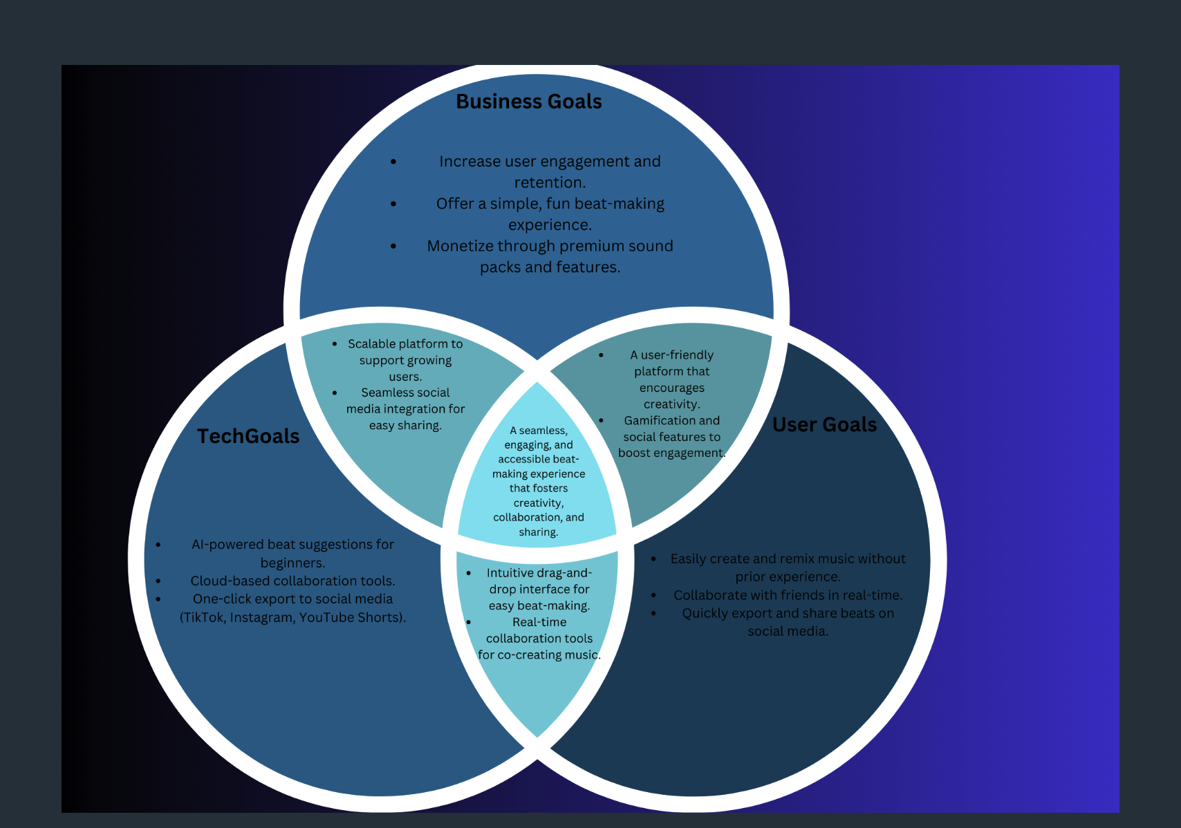
My research led me to wonder….
How might we use visual elements like stories, photos, and infographics to build emotional trust?
Project Goals….
User flow


04 design
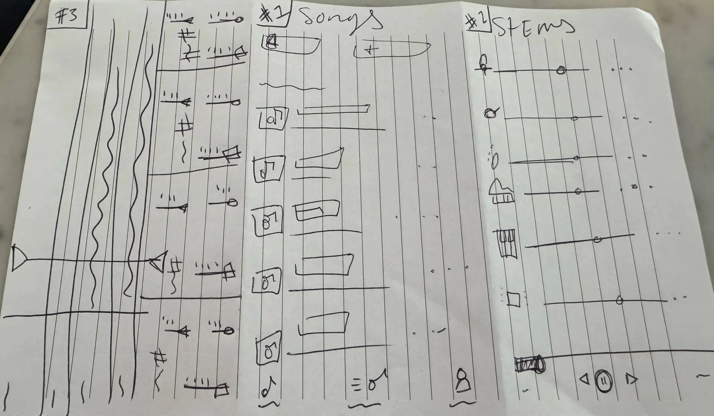
Low Fi
Mid fi

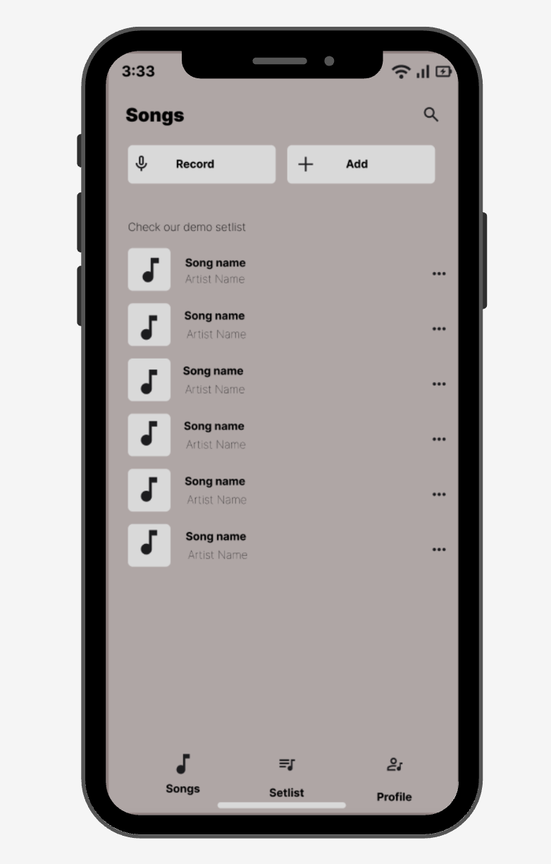

UI Style Template
User Interview
Usability Testing
Interviewed 5 users on music listening and creation habits.
Explored motivations, challenges, and feature wishes.
Results
Music creation tools feel too complex and time-consuming.
Users want simple, beginner-friendly remix features.
Gamified learning, drag-and-drop tools, and social sharing were most appealing.
Next Steps
Build easy remix tools with drag-and-drop and pre-made beats.
Add quality samples, onboarding, and real-time collaboration.
Improve discovery of community-created music.
Revisions

Added onboarding text for clarity.

Removed slider timestamps.

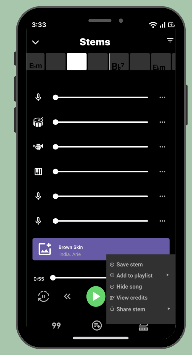
Standardized stem row design.
05 Final design


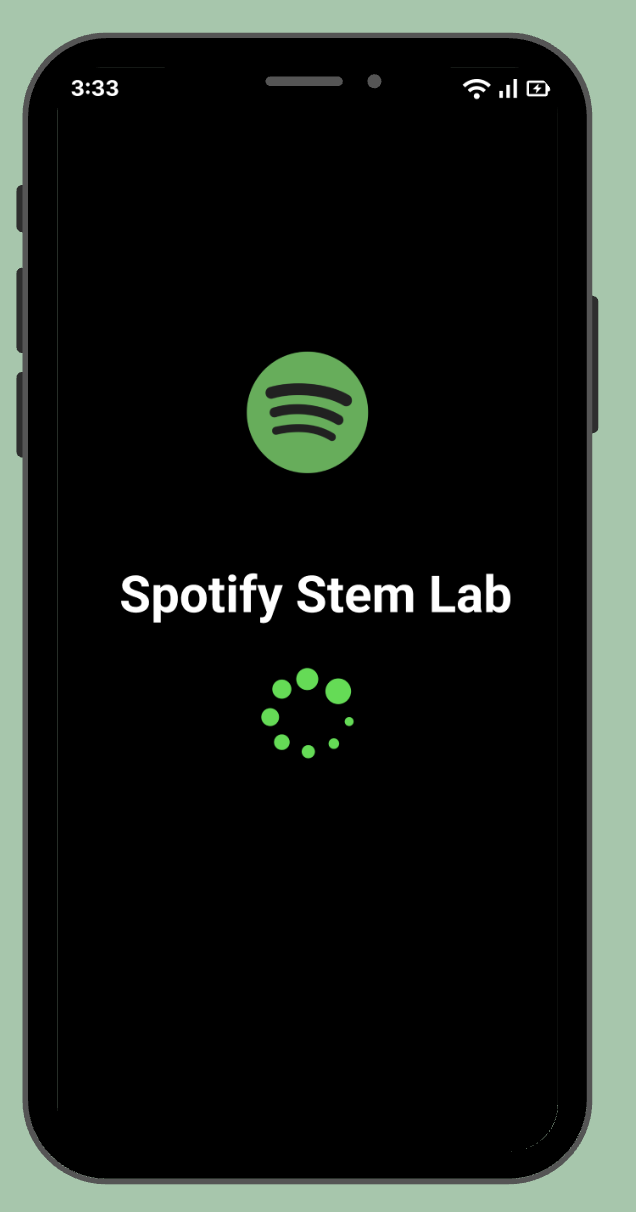


Interactive prototype

next step and future improvements