Lovers Lane :
End-to-End Application
Case Study 4 ~ 6 min read

The Problem
Sharing personal moments online often feels exposed and intrusive. Public platforms lack privacy, while sending updates one-by-one to family is time-consuming and fragmented, making it hard to stay close without sacrificing security.
The process
User research and synthesis, ideation, prototyping, interaction, usability testing
My Role
UX/UI designer
Tools
Figma
Duration
4 Weeks
The Solution
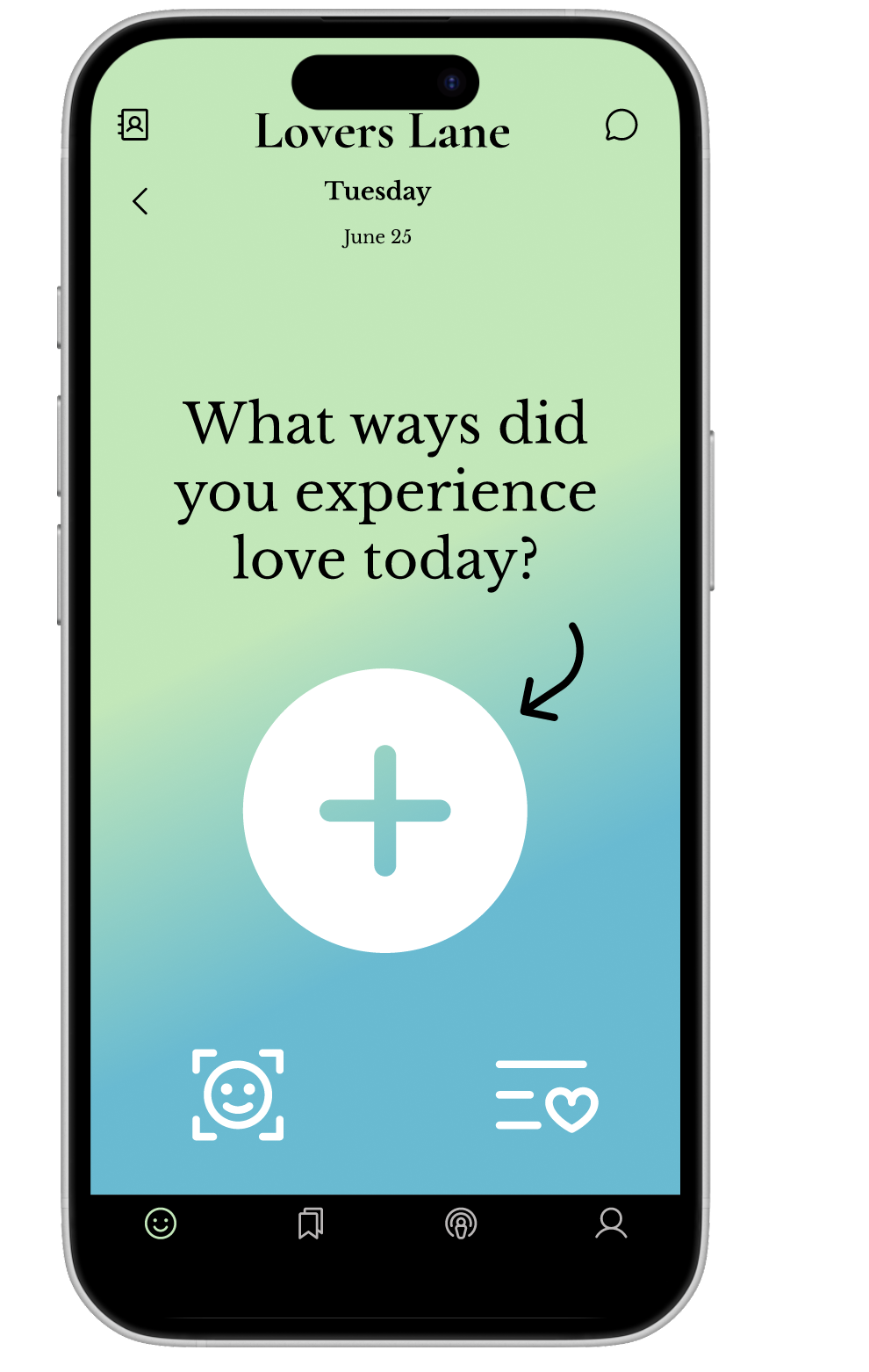
Lover’s Lane is a private, family-focused social app that replaces the noise and exposure of public platforms with a safe, intimate space for sharing. By allowing users to upload photos and revisit past memories, the app keeps loved ones connected in a secure, streamlined environment—making it easy to share life’s moments without sacrificing privacy.

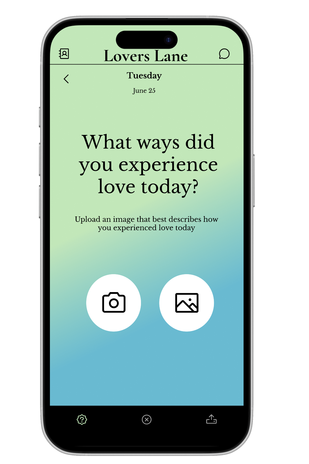
2. Photo Uploads
Simple, intuitive tools for adding new pictures to share instantly.

1. Private Sharing
Only approved family and close friends can view and interact with your posts.

3. Memory Archive
A dedicated space to browse and relive past posts and shared moments.
01 Research
Private Sharing is an Overlooked Digital Need
Through interviews and surveys with 10 participants, I explored how people share personal moments online and how they feel about privacy. Users consistently expressed discomfort with public social media, citing overexposure and a lack of control. Many still value digital connection but want it in a secure, intimate environment where they can share without fear of unwanted visibility.
From these conversations, I identified patterns in their motivations, needs, goals, and pain points when sharing personal content online.
Needs:
Secure invite-only photo app; revisit past posts; simple upload and viewing.
Goals:
Safe space for intimacy; effortless family sharing; organized memory archive.
Pain Points:
Public platforms feel intrusive; one-by-one sharing is slow; no family-only tools; privacy settings are confusing.
Competitive Research Summary
I analyzed Been Together, 1 Second Everyday, and Journey.
Strengths
Strong emotional storytelling, habit-forming media, and simple, guided designs.
Weaknesses
Limited collaboration, stagnant features, unclear archiving, outdated UX.
Opportunities
Rising demand for private memory spaces, AI tools, and emotional wellness trends.
Threats
Social media, wellness apps, subscription fatigue, and crowded markets.
Insight
There’s room for a secure, family-only sharing app that blends private memory-keeping with the ease of social media.
Motivations:
Private sharing with loved ones; preserving memories; avoiding public noise; safe space for life events.
The Memory Keeper
The Private Sharer
The Sentimental Organizer

Maya Thompson
30, Oakland, CA, Married, Visual Storyteller/Freelance Designer
A sentimental creative who loves preserving meaningful memories and connecting with loved ones, Maya seeks a private, emotionally rich space away from the noise of public social media.
The Memory Keeper
Cherishes capturing life’s small moments and turning them into meaningful keepsakes.
The Private Sharer
Wants to share updates with loved ones without the noise or exposure of public platforms.
The Sentimental Organizer
Enjoys neatly storing and revisiting memories, but finds current tools cluttered or hard to navigate.
Bio:
Sentimental creative who wants a private, meaningful way to capture and share memories.
Habits:
Shares and saves photos, sends voice memos/playlists, journals, creates keepsakes, makes collaborative albums.
Goals:
Save memories, stay connected, capture emotions, reflect easily.
Pains:
Forgets moments, juggles too many apps, struggles with clunky tools, lacks privacy.
Most Used Apps:
Instagram, Pinterest, Spotify, Apple Photos, Google Drive, WhatsApp.
My research led me to wonder….
How might we create a space that feels safe and sacred for shared memories?
User flow

04 design
Low Fi
This sketch maps out the core flows of Lover Lane, focusing on exploration, interaction, and expression. It uses simple layouts to visualize how users move between browsing, connecting, and sharing.
Home / Explore: Grid of profile or interest cards with visual cues (icons, images, play buttons) for quick scanning.
Connections: Structured rows for chats, matches, or shared activities.
Profile / Content Cards: Individual panels highlight personal details, media, or prompts.
Bottom Navigation: Key actions like explore, connect, add, and profile placed along a central navigation bar.

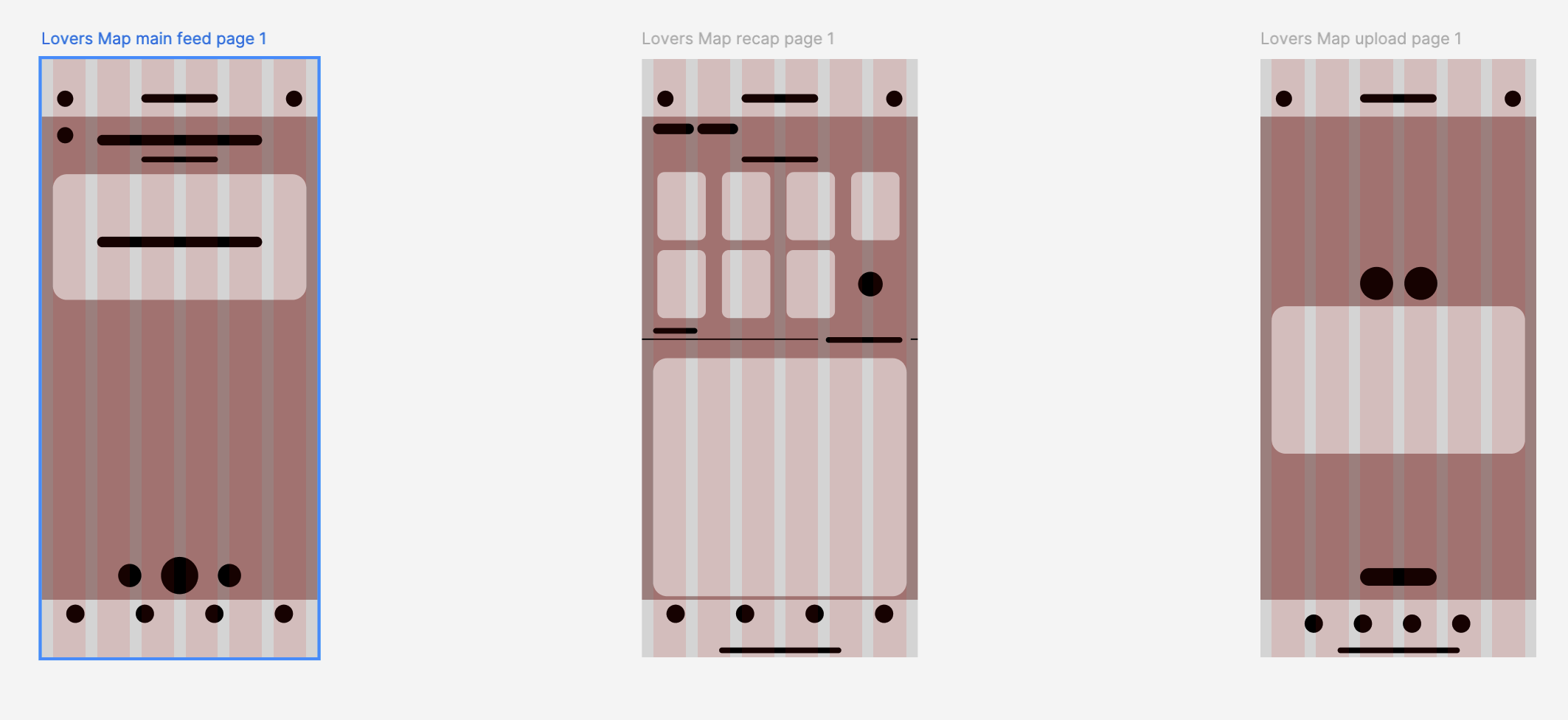
04 design
Mid fi
These screens refine the lo-fi sketches with structured layouts and clearer navigation.
Main Feed: Streamlined vertical feed with bottom navigation.
Recap Page: Grid view of highlights with space for details.
Upload Page: Centralized upload area for simple sharing.
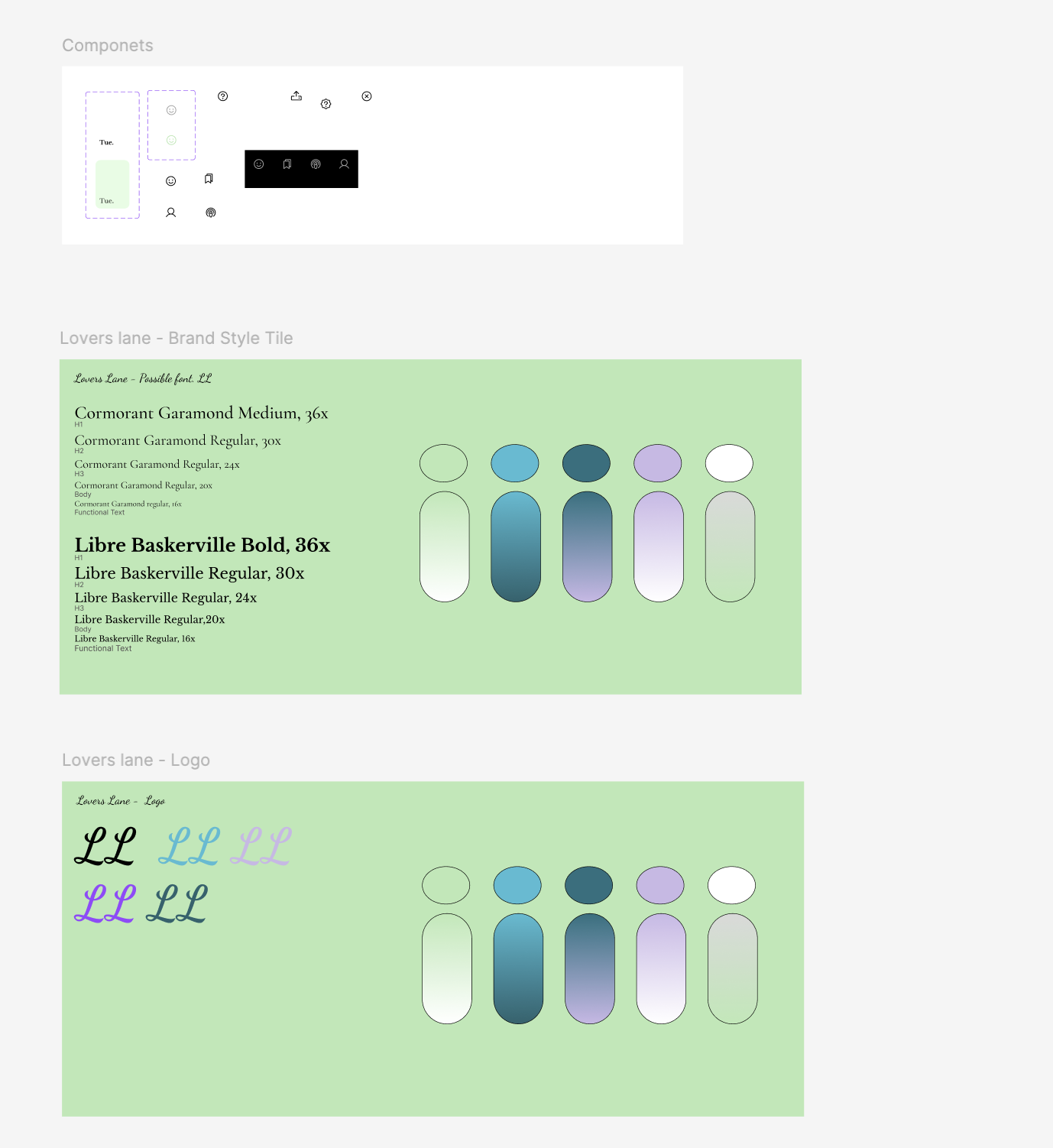
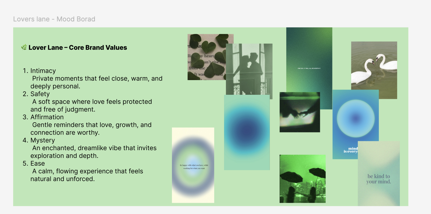
UI style Templete
User Interview
User Testing:
5 users tested Lovers Map wireframes.
Observed navigation, posting, and recap flows.
Results:
Users saw center as posts/memories and recap as gallery.
Wanted clearer button labels and simpler upload flow.
Next Steps:
Add icon labels/onboarding.
Clarify recap tiles and upload actions.
Revisions
Made CTA buttons larger.
Made the onboarding process much simpler


