Free Inspiration:
Responsive Wed design
Case Study 3 ~ 6 min read

The Problem
A crowded, disorganized donation website creates barriers to giving. Cluttered layouts, scattered information, and a hard-to-find donation section leave supporters confused and less likely to contribute.
The process
User research and synthesis, ideation, prototyping, interaction, usability testing
My Role
UX/UI designer
Tools
Figma
Duration
4 Weeks
The Solution
The redesigned donation website transforms a cluttered, confusing experience into a streamlined and trustworthy platform. By simplifying navigation, centralizing donation options, and presenting information in a clear, visually appealing way, supporters can easily find causes, understand impact, and complete donations without frustration—making giving feel effortless and meaningful.
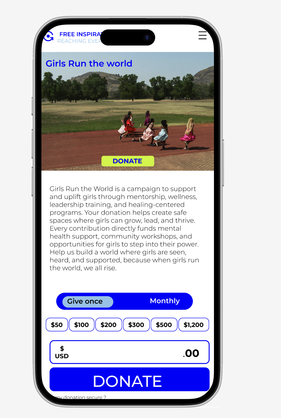
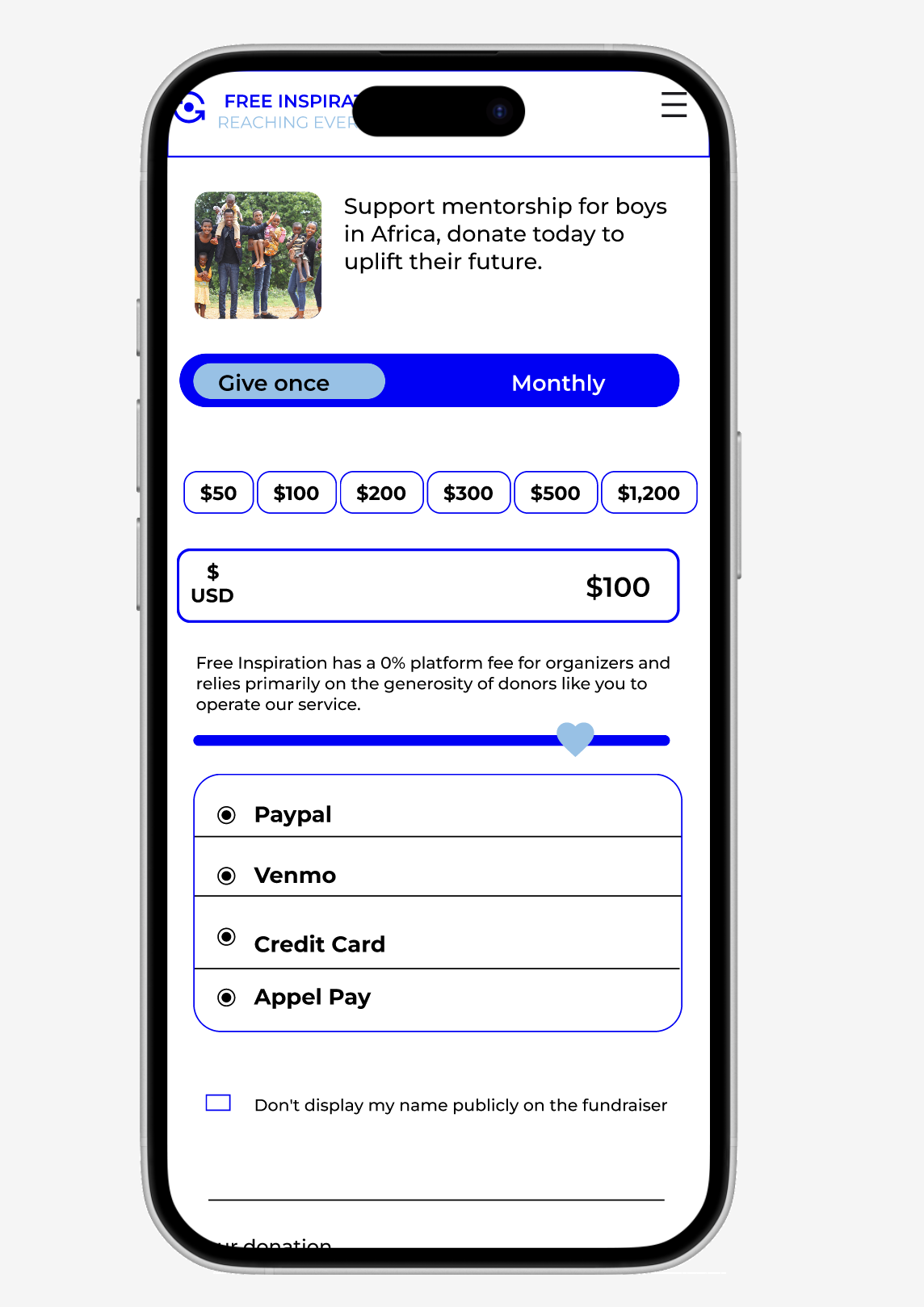
Simplified Forms
Step-by-step donation flow with clean input fields and payment options reduces friction and speeds completion.
Clear Donation Path
A prominent, consistent “Donate” button across all pages ensures supporters can contribute from anywhere on the site.
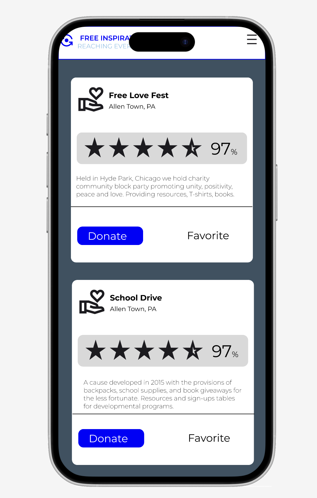
Organized Cause Listings
Structured cards with images, brief descriptions, and ratings make it easy for users to choose where to give.
01 Research
Donation-Based Giving Needs Clarity and Trust
Through interviews and feedback synthesis, I gathered insights into how people experience donation-based giving online. Users consistently voiced the need for clear, emotionally engaging, and trustworthy platforms. While they want to support causes, many are deterred by confusing layouts, unclear donation flows, and a lack of transparency about impact.
From this research, I identified patterns in their motivations, needs, goals, and pain points when interacting with nonprofit websites.
Needs:
Clear donation flow, visual storytelling, transparency, mobile-friendly design, and easy sharing.
Goals:
Build trust, make giving easy, show impact quickly, and create emotional connection.
Pain Points:
Build trust, make giving easy, show impact quickly, and create emotional connection.
Competitive Research Summary
I conducted a SWOT analysis of Charity: Water, GlobalGiving, and UNICEF.
Strengths:
Charity: Water’s storytelling, GlobalGiving’s donor choice, UNICEF’s global credibility.
Weaknesses:
High costs, narrow scope, slow processes.
Opportunities:
Growth in social fundraising, broader aid areas, and stronger grassroots support.
Threats:
Competing nonprofits, donor fatigue, and regulatory pressures.
Insight:
A nonprofit combining storytelling, flexibility, and credibility—while staying lean and transparent—could stand out.
Motivations:
Supporting causes they connect with, inspired by stories, and motivated by quick, easy, meaningful actions.
The Cause-Driven Supporter
The Visual Learner,
The Trust Seeker

Soul Lucas
26, New York City, Single, Freelance Artist
Cause-driven creative who supports mental health, education, and climate justice, seeking simple, trustworthy ways to donate, share, and promote causes online.
The Cause-Driven Supporter
Passionate about mental health, education, and climate justice.
The Visual Learner
Prefers bite-sized, visual updates over long text.
The Trust Seeker
Wants simple, clear ways to give and share without doubting legitimacy.
Bio:
Cause-driven creative seeking simple, trustworthy ways to support and share causes.
Habits:
Donates, signs, shares, learns via short videos, prefers visuals.
Goals:
Support, trust, share, learn visually, and connect emotionally.
Pains:
Distrusts outdated sites, dislikes clutter, needs clarity and speed.
Most Used Apps:
Tumblr, Instagram, YouTube.
My research led me to wonder….
How might we use visual elements like stories, photos, and infographics to build emotional trust?
Project Goals….

User flow
This flow highlights the donation and sponsorship journeys, showing how users move smoothly from the homepage to key actions like selecting amounts, submitting info, and receiving confirmation. It emphasizes clarity, minimal steps, and a user-friendly path that reduces friction.

04 design
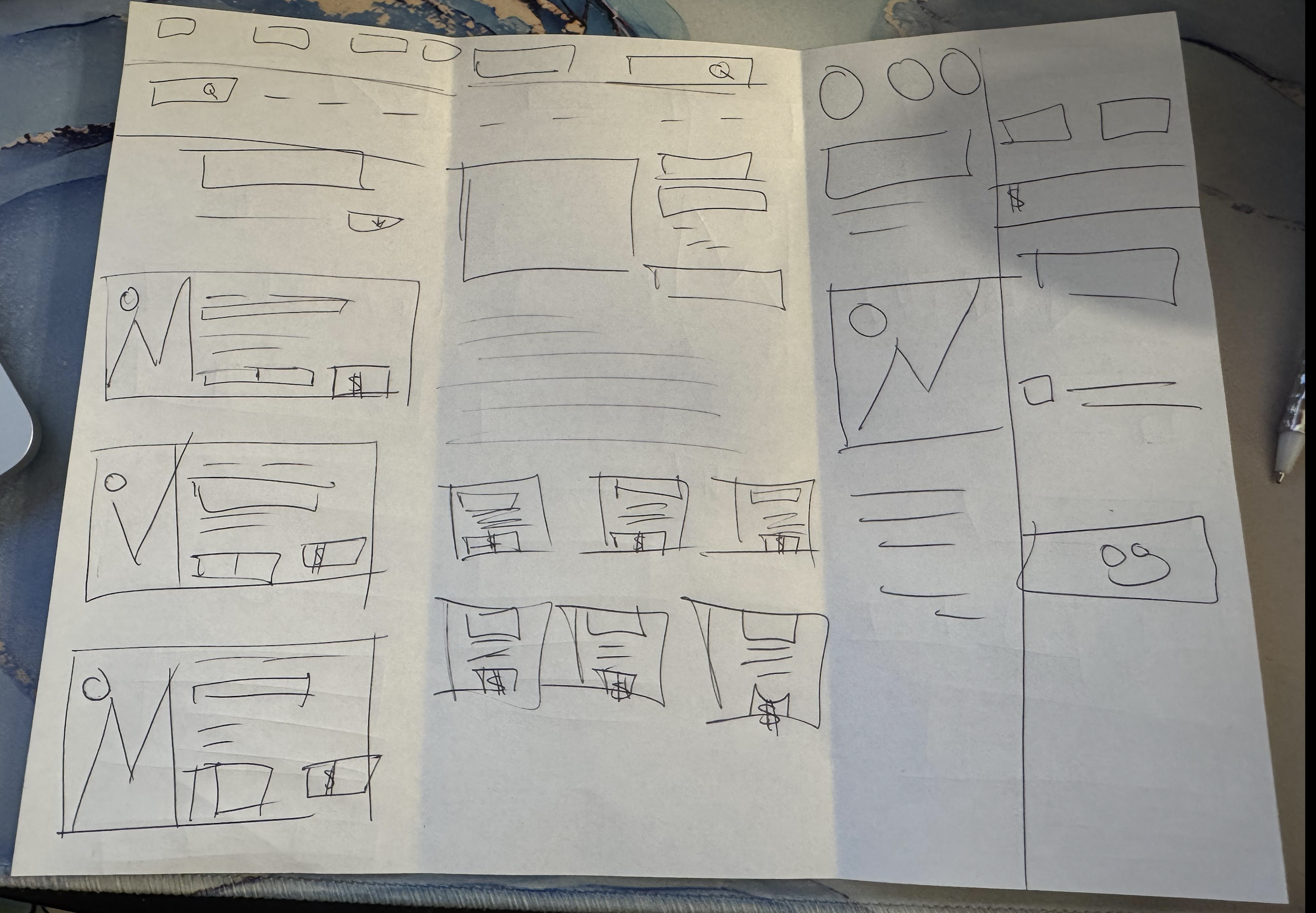
Low Fi
These low-fidelity sketches map out the donation website’s structure with a focus on clarity and ease of use. They show:
A simple header and hero section for key messaging
Image + text blocks for stories and mission highlights
Clear donation options with preset amounts
Sections for updates, testimonials, and impact stories
A closing call-to-action at the bottom
The designs keep things simple, visual, and donation-focused, leaving room for refinement.

Mid Fi
Mid-fi sketches show a more structured donation flow with clear grids, organized info pages, and a streamlined payment process.
Grid-based layouts for stronger structure and alignment
Multiple formats tested for donation info (cards, columns, text-heavy)
Clear sections for images, text, and calls-to-action
Payment flow with input fields and simplified steps
Focus on smoother navigation and readability

User Interview
User Testing:
5 user interviews with donation wireframes.
Tasks tested clarity and navigation.
Results:
Interface felt clean and intuitive.
Confusion from unlabeled icons and unclear tap actions.
Next Steps:
Add labels and brief descriptions.
Use visual cues or two-step confirmation.

